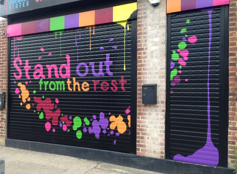
Claremont estates were in the process of re-branding their office and needed their shutters to follow suit! They asked our artists to create a design that would work with their new branding.
After meeting with the team at Claremont Estates, our in-house designers got straight to work creating a series of ideas for their shutters. It took just our artist one evening to paint the chosen artwork. The shutter was fixed to a clear Perspex layer which provided a semi-flat surface for our artists to paint on. The top of the shutters were made to look like palettes of paint with colour dripping down onto the shutters. Their company motto ‘Stand out from the Rest’ was painted at the centre of the mural and had the effect of looking as though the drips of paint were running down the shutter to form the letters. Our artists painted this effect free hand whilst the lettering piece was created using stencils, which kept the font looking crisp and professional.
If you have shutters that need some revitalising then get in contact with your ideas. Not sure what you want yet?… Have a look at Our Artwork for more inspiration!

